Okay, boys and girls- are you ready to have some fun?  "Are you just saying that, or are you really ready to have some fun?"
Okay, then hold on tight and strap yourself in if you're easily moved, because this might just bring tears to the eyes.
Presenting...NFL RUNWAY: AFC East.
And first up are the...BUFFALO BILLS- Let me say right off the bat: I KNEW IT, I KNEW IT, I KNEW IT, I KNEW IT! I held off on making this post a couple of times, because the Bills appeared to have changed their uniform and gotten rid of their hideous creation from the recent Super Bowl years. It screams of the worst fashion ideas from the 1980s and 1990s. So imagine my excitement when in the first two weeks they went retro and brought back the old-time uniforms. But in the back of my mind I kept thinking they would revert back to last years uniform, which they did Sunday. Which begs the question WHY??!!

(Or, as Floyd R. Turbo would say, "This raises the question, kiss my chinstrap!") So, I have to include both uniforms in this year's evaluation.Helmet Design:

Someone sat down and thought to themselves the following question:
How many colors can I get on one helmet, and how many different ways can I put them?
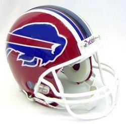
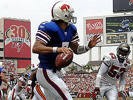
Let's see...we have a red, white, light blue, and a darker, navy-like blue. Or is it black? I can't tell. And the colors are everywhere on this helmet.Here is my number one tip to all you budding NFL fashion designers out there- KISS (that means keep is simple, stupid...lest you think something about else about me).
This helmet could be excellent. Because I love the buffalo decal. But the stripes (which as you'll remember I'm not a big fan of) do this puppy in. I think there are seven of them down the middle, starting with the outer bold white, the skinny light blue, the skinny white, and the bold dark center stripe.
Seven stripes? In the middle of a helmet? Are you kidding me?
There is way too much contrasting going on. I can get with the white cage. But I think what they tried to do is put a white border around all the color changes, hence, all of the stripes. WAY TOO BUSY.
And the buffalo decal has all the contrast and color also. With a stripe. It doesn't work.

Which is why I love the old school helmet they brought out in weeks one and two. A simple white with a red stripe bordered with blue and a red buffalo. That's it. I love the buffalo decal. The gray cage does take away slightly from the overall helmet effect, but it is definitely out of the 1970s.
Helmet design score:
Retro helmet- +1
Modern helmet- -1
Overall- 0 (average of the two)
Color scheme-
As discussed above, the modern color scheme belongs more on a Ukranian circus clown rather than an NFL player. Red, white, light blue, dark blue, and...is that gray? It's not simple, and it's not well matched. It's one saving grace? At least they didn't add yellow.
Note to the Bills:
Pick a color and go with it.
The retro uniform is a simple red, white, and blue. The blue is a lighter shade and much more attractive than on the modern version.
Color scheme score:
Retro- +2
Modern- -1
Overall- +0.5 (average of the two)
Jersey:
Again, we have to break this down way too much more than we should have to do. We've got home and away options in modern design, and a home option in the retro.

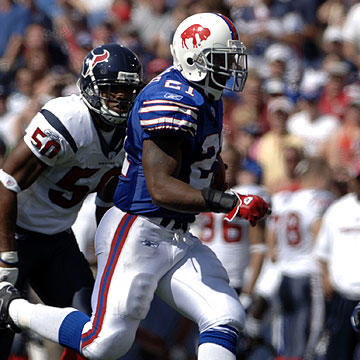
The modern home version jersey, taken just by itself and seen in the above photo, is just fine. It's the only thing on this uniform that is simple. A solid dark blue number with white numbers having a gray border. And I am a fan of the upper arm numbers rather than the shoulder pad numbers. But notice the little details that some ADHD designer decided to add. A V-neck red collar and faint lighter blue skinny shoulder stripe. Question: if I'm sitting in Rich Stadium, whether on the field or high above the field, can I see these little details? Of course not. We can barely see them in these up close photos. So what's the point?
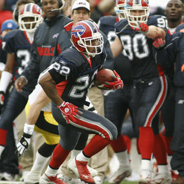
The modern away jersey screams of someone with too much time on their hands. They took just enough time to ruin it. Check it out:

Wow. That's one ugly representative in this contest. A block of blue across the shoulders? A red lateral stripe from the armpit to the waist? The red border of the block? Huh? Pajamas- yes. NFL uniform- no.

The retro jersey puts these to shame, which again makes me wonder why they didn't stick with this after the first two weeks. First of all, the blue color they picked is much more attractive. The stripes on the sleeve are just a tad busy, but don't clash with the rest of it. I'm not a fan of the shoulder pad numbers cluttering it up, but overall this is a vast improvement.
Jersey score:
Modern home: 0
Modern away: -2
Retro home: +1
Overall: -0.3. (average of above)
Leg wear:
Again we have to go through 3 versions to get at the overall truth.
The modern home version below the waist and pictured above is ugly. Period. Pants with a dark blue base, lateral central bold red stripe bordered by white bordered by gray? This is cool- if you're on mushrooms. And the bright red long socks bring to mind only two words: Pippi Longstocking.
The modern away version above is different. At least there are only 3 colors. But the directions of the stripes all seem to clash. I call this "directional clashivity." Notice the vertical red stripe with blue border of the pants abruptly ending in a solid red block at the top of the sock, followed by a thin horizontal blue stripe, followed by a block of white, and ending in the diagonal stripedness of the shoes.

The retro version rocks. A shiny white pant sporting a racy looking thin blue stripe with red border. Then there is a thin block of light blue sock matching the stripe, with a solid white stretching to black shoes. I've always been partial to black shoes on a football uniform. And if you want that real retro look, you gotta have the black shoes.
Leg wear score:
Modern home- -2.
Modern away- -1.
Retro- +2.
Overall: -0.3 (average of above)
Overall Effect:
The modern home version has the overall effect of Hurricane Rita on Gulf oil rigs- a disaster.
The modern away version reminds me of the flannel pajamas I used to get as a Christmas present from my grandma every year. Good for sleeping, bad for football.
The retro model is as sweet as that guy Fabian (on Filthy Rich: Cattle Drive) is a total wuss.

Overall effect score:
Modern home- -2
Modern away- -2
Retro home- +1.
Overall- -1 (average).
Historical factor:
I love the retro uniform. Why they ever went away from it is beyond me. Still I give them a bonus point for having the sense to break it out again this year.
Historical factor score: +1
Summary
Helmet design- 0
Color scheme- +0.5
Jersey- -0.3
Leg wear- -0.3
Overall effect- -1
Historical factor- +1
TOTAL SCORE -0.1
Up next: New England Patriots.


No comments:
Post a Comment