It's like this. The haves have, and the have-nots have not. Life isn't fair. But if you believe Bill Murray in Meatballs:

"IT JUST DOESN'T MATTER."
There are always people who have it all. Brains, brawn, good looks, and money. But:
"IT JUST DOESN'T MATTER."
The rich get richer. The poor get poorer. But just keep saying it to yourself:
"IT JUST DOESN'T MATTER."
Do I have a point? Well, not usually, but let me segue into...
NFL Runway...AFC East! Up now are the New England Patriots.
What does the above have to do with NFL fashion? Well, be patient.
The New England Patriots are the two-time defending Super Bowl champions. In fact, they are even better than that. They have won 3 of the last 4 Super Bowls. And they are a top contender to win again this year. They are the best the NFL has to offer.
Which sort of makes it unfair that they have such a good-looking uniform. I have very little to pick at with this outfit.
Not only are the Patriots the best team on the field, they are most likely going to be better looking while they are dismantling your favorite team.
But remember...
"IT JUST DOESN'T MATTER."
Helmet design:
No stripes. That immediately makes me like it. A patriotic (no pun intended) Minuteman dude on the side. A sharp red cage contrasts the silver helmet beautifully.
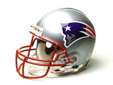
Not much else to say here.
Score: +2
Color scheme:
No American will deny the beauty of red, white, and blue. The metallic silver blends in well, I believe. And the color blue is a dark, rich shade. It is the dominant color of the basic trio. And whether on televsion or still photos- it takes a pretty picture.
Score: +2
Jersey:
On the home jersey, seen below, the only disparaging thing I can come up with is I don't like the numbers over the shoulder pads. Just a minor detail. I love the stripe at the top of the sleeve and patriot man on the sleeve. There's a nice red trim to the silver numbers.
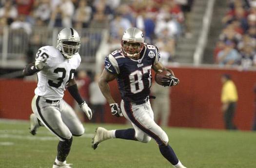
The away jersey below has a more major flaw, but I love the basic white with the blue numbers with red border, as well as the blue sleeve stripe and patriot dude on the sleeve. I don't like the shoulder pad numbers. And I really dislike that side stripe from the waist to the armpit. It is totally unnecessary.
Score:
Home jersey- +1
Away jersey- 0
Average- +0.5
Leg wear:
The home wear below is quite appealing. A silver with blue side stripe, followed by a long blue sock ending in white, with white shoes. I don't mind the white shoes on this number. 
The away version below starts out well. I love the color of the pants. The stripe is slightly busy but not enough to detract from that rich blue. A solid white sock would be better than what we have here. That stripe horizontally across the sock is totally uncalled for. It gives the dreaded "directional clashivity" with the vertical pants stripe, which doesn't belong on such an otherwise nice outfit.
Score:
Home version- +2
Away version- +1
Average- +1.5
Overall effect:
The home uniform is classic. The away uniform has some flaws, but enough strengths to keep it reasonably attractive.
Score:
Home- +2
Away- +1
Average- +1.5
Historical factor:
The Patriots have to be applauded for moving away from that hideous uniform they used to have. They had some freak red that was not really that red, with some white and very little blue. And that helmet- yuck. White with a full size Minuteman bending over (yes, bending over) a football.
Score: +1
Summary:
Helmet design- +2
Color scheme- +2
Jersey- +0.5
Leg wear- +1.5
Overall effect- +1.5
Historical factor- +1
TOTAL PATRIOTS SCORE: +8.5
Yes, it's true. Some do have it all. And you have...
"JACK SQUAT", as the immortal Chris Farley (as Matt Foley) would say.
So as the Eagles (the band, not the NFL team) might say: "Get Over It."
Up next: Miami Dolphins.

No comments:
Post a Comment