
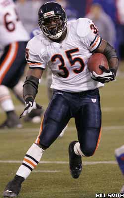
Chicago Bears.
Helmet Design: Simple and to the point, a large C is all that is needed, whether dark orange (contemporary) or white (nostalgic), to go with the navy background. I am not a big fan of stripes, so the absence here helps develop the simplicity. While not beautiful, it gets the job done in a nice way.
Score: 1.
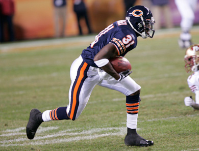
Color Scheme: Navy, white, and orange. Okay, I am one of those people who doesn't get the whole orange and blue thing that a lot of teams put together. But the orange here is used only as trim, not as a main color, so I think it works.
Score: 1 for home, 1 for away, which averages to a 1 (higher math is my thing).
Jersey: Again, simplicity goes a long way. The numbers on the sleeve is a better look than on the shoulders. And as for the colors, they are all there.
Score: 1 for home and 1 for away, averages to 1.
Leg Wear: Three varieties. The home version with the simple double stripe on the pant leg is attractive, and this same version works well with the white away jersey. I like the old school look of the dark shoes, and the small stripes on the socks gives just enough distinction to the sock that it is unique. I don't like the blue pants, but I don't dislike them. But I like the away white pants better with the white jersey better. Unfortunately, they have not worn those for awhile.
Score: 1 for home, 1 for white away, and 0 for blue away. Average: 0.67.
Overall Effect: On a snowy day in December or January, the home jersey is a definite 2. But given the relative rarity of this (a January game for the Bears- HA), I give the home and away versions a 1 if pants are white, while again a 0 if blue pants are worn.
Score: Average 0.67.
Historical Factor: I like the look of the white C helmet better than the orange, so I am going to subtract a point from the score for the current version of the uniform. However, due to the lack of major changes over the years and the overall allure and simplicity that has not been ruined by at the moment trends, I will give a point.
Score: -1 plus 1, or 0.
In summary:
HD: 1
CS: 1
J: 1
LW: 0.67
OA: 0.67
HF: 0
TOTAL BEARS SCORE: 4.34

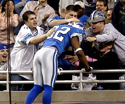
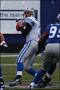
Detroit Lions.
Helmet Design: I can get with the Lion. Again it is simple, just a silhouette. The silver/gray with blue color works too. What I can't go for are the stripes. There are very few helmets that the stripes help, and this ain't one of them. The white just doesn't fit the overall scheme. Too bad, could have been a 2.
Score: 1.
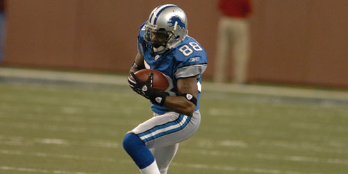
Color scheme: Love the blue, Honolulu I believe it is called. But I think a tan or gold, like UCLA, would be a better secondary color than the gray with this shade of blue. And the home scheme works better than the away.
Score: 1 for home, 0 for road. Average of 0.5.
Jersey: Definite beaut here. I'll overlook the shoulder numbers.
Score: 2 for home and 2 for road. Average of 2.
Leg Wear: Again, I'm not so sure this is the right color for the pants. But I do like the side stripe and socks.
Score: 1 for home and 1 for away. Average of 1.
Overall Effect: Home looks sharp, away looks pretty dull.
Score: 1 for home and 0 for away, average 0.5.
Historic factor: Got to love the fact there has been little messing with this nice number over the years. This is a bonus of 1.
Summary:
HD: 1
CS: 0.5
J: 2
LW: 1
OA: 0.5
HF: 1
TOTAL LIONS SCORE: 6.
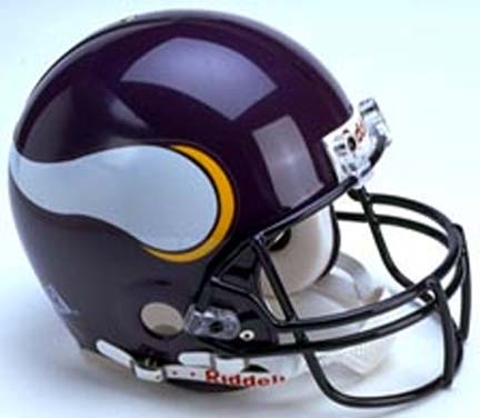
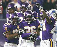
Minnesota Vikings.
Helmet Design: The rich purple and the simple viking horn make this a classic. You couldn't make anything any better than this. As good as it gets.
Score: 2.
Color Scheme: Purple and gold do go together and make nice team colors. But throw in a little too much white and it starts to break down.
Score: 2 for home, 1 for away, average 1.5.
Jersey: I like the purple, but I'm not a fan of the shoulder numbers. Therefore, only a 1 for the home jersey. I like the gold shoulder stripe on the away jersey, but it is not as rich as the purple. So a 1 for it also.
Score: 1 for home and away, average 1.
Leg Wear: I like the pants with the stripe, but I don't like the socks, shoes and pants together. Too much white. Dark shoes and socks would be the way to go.
Score: 0 for home, 0 for away, 0 average.

Overall Effect: Put the whole thing together and it looks like a winner at home. Only slightly less attractive, due to all the white, is the road uniform.
Score: 2 for home, 1 for road, average 1.5.
Historic Factor: Again, not screwing this up by adding trendy things over the years counts for something.
Score: 1.
Summary:
HD: 2
CS: 1.5
J: 1
LW: 0
OA: 1.5
HF: 1
TOTAL VIKINGS SCORE: 7.
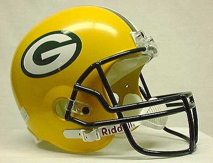
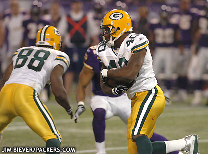
Green Bay Packers.
Helmet Design: Not a fan of the stripes, but this works okay. The G is nice and bold but the yellow color with white and green doesn't work.
Score: 0.

Color Scheme: Yellow and green, with some white thrown in. You either love it or hate it. The green home uniform works, but the white with the yellow away uniform doesn't.
Score: 1 for home, -1 for away, average 0.
Jersey: The home green with yellow and white stripes looks good. The white numbers also do. And I also like the away scheme.
Score: 1 for home and 1 for away, average 1.
Leg Wear: Doesn't work for me. With the yellow helmet, the yellow pants are okay, but I just don't like it.
Score: -1 for home and -1 for away, average -1.
Overall Effect: It's okay, but I think it could have been done better.
Score: 0.
Historic Factor: I'm all for tradition, but I think this uniform could have been redone to make a more attractive presentation. And it's not like the Packers haven't been around very long to do so.
Score: -1.
Summary:
HD: 0
CS: 0
J: 1
LW: -1
OA: 0.
HF: -1
TOTAL PACKERS SCORE: -1.
No comments:
Post a Comment