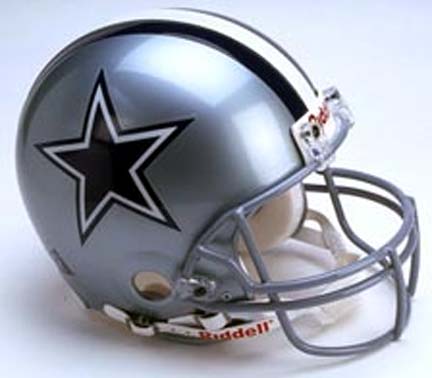
Dallas Cowboys.
Helmet Design: A definite classic. Silver-gray base. Blue star double bordered creating contrast. The triple stripe is always bad on a busy helmet, but this one ain't busy. In fact, I think a more bald look would not work with this helmet. I like the stripe on this one.
Score: +2
Color Scheme: Blue, silver-gray, and white. Perfectly well matched.
Score: +2
Jersey: For football teams, this one is backwards. I have never understood why the Cowboys wear white at home. Because the blue jersey is about the best looking thing on the planet, and we only get to see it once, maybe twice, a year. Not that the white is bad, but it is plain next to the deep blue with double bordered numbers. White is after all, white. I don't go for the numbers on the shoulders (personal taste). Put them on the sleeves where they belong.
Score: 0 for white, +2 for blue, average of +1.
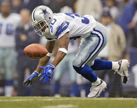
Leg Wear: Silver with white stripe bordered by blue. Sensational. Blue stockings. White shoes.
Score: +2

Overall Effect: Classy, simple, and professional. But again, I've got to ask, why not blue jersey at home? It's a better look.
Score: +2 blue, +1 white, average +1.5.
Historic Factor: I like the Cowboy tradition. Not much change over the years. Looks as good now as it did in the 1960s.
Score: +1.
Summary:
HD: +2
CS: +2
J: +1
LW: +2
OE: +1.5
HF: +1
TOTAL COWBOYS SCORE: +9.5
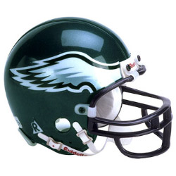
Philadelphia Eagles.
Helmet Design: The White/Silver Wing thing is kind of cool. But I think a whole eagle or eagle head a la the Raven on Baltimore's helmet would look better. I don't care for the black border or black cage. When in doubt, keep things simple. I like the fact the rest of the helmet is a solid color, although the color leaves something to be desired. I do have to admit, this is better than the hideous early '70s white helmet with bright green wings. This is okay, I guess.
Score: 1.
Color Scheme: Green, silver, white, and black. Lose the black. The eagle is such a majestic animal, so why this color green? This green has too much of a blue tone for my taste. It's kind of teal-esque. How about a nice military army-issue green?
Score: 0

Jersey: The home version does look good in a photo. But that alternative black thing is hideous. I can't justify putting up a picture of it (go to the Eagles official website if you must look, but consider yourself warned). The eagle on the sleeves is a nice fit. The white numbers are cool with the black border. The white away jersey with green numbers passes.
Score: 1 for home green, -2 for black, 1 for white, average 0.
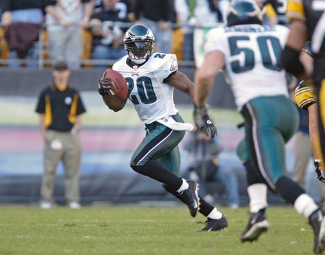
Leg Wear: The home version rules. I love the look of the black shoes, black socks, and white pants with black and green stripe. But look at the traveling pants- grade A ugly. Something about it makes me hungry, whatever could it be? The black socks and black shoes bring it some redemption.
Score: 2 for home, -1 for away, average +0.5.
Overall Effect: I've got it! I finally figured out what I don't like about this uniform and why I salivate looking at it. It IS the colors. It's chocolate mint ice cream colors. Nice for food, bad for uniforms.
Score: 1 for home, -1 for away, and -2 for that black monstrous thing. Average -0.67.
Historic Factor: I am giving this a +1 for the improvement over that late 60s and early 70s Medusa outfit.
Summary:
HD: +1
CS: 0
J: 0
LW: +0.5
OE: -0.67
HF: +1
TOTAL EAGLES SCORE: +1.83.
Washington Redskins.
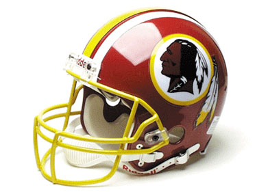
Helmet Design: Umm. How do I put this? It's kind of busy, but not in a Bengals sort of way. I hate the 5 stripes down the middle. Hate it. It looks awful. It might go well with a polka dot shirt and striped pants, though. The decal is kind of cool. The American Indian guy doesn't offend me like it does others. But why are there feathers on the dude, and then feathers coming off the decal. Too much. The yellow cage is goofy too. I guess I'm a fan of simplicity; the old Redskin helmet with the spear and solid red rocked. If the stripes suddenly went AWOL, I'd actually like this helmet.
Score: -1.
Color Scheme: Dark red, white, and yellow. (I say dark red because I have heard it called maroon and burgundy). Not a bad concept. But the way these 3 are used is a mistake. The only yellow utilization on this puppy is for striping. Let's just say this combination is not tastefully done.
Score: -1.
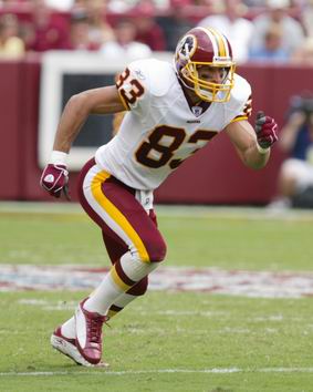
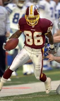
Jersey: Another backwards use of the jersey. Wearing white at home would make sense if the white jersey were more attractive than the dark, but as with the Cowboys, it's not. The Redskins used to wear red at home. What form of dementia would make the team's leaders conclude this white version looks better? I do like the numbers on the sleeves rather than shoulders. The dark jersey has a very rich appearance.
Score: +2 for dark, 0 for white, average of +1.
Leg Wear: I don't want to sound like a broken record, but compare the above clown-wear to the classy white below. No one not on digitalis would prefer the former. Even the stripes clash on the home rendition, running vertical on the pants and horizontal on the socks. The red and yellow stripe on the white pants looks okay but keeps this from a +2.
Score: -2 home version, +1 white version, average of -0.5.
Overall Effect: Ugly home uniform. Very attractive dark road uniform. Redskins fans, revolt.
Score: -2 home, +1 dark, average -0.5.
Historic Factor: The old school Redskin helmet and outfit rules over all of its domain. So a -1 for drifting away from it. And that hideous yellow monster from the early 70s is worth another -1.
Score: -2.
Summary:
HD: -1
CS: -1
J: +1
LW: -0.5
OE: -0.5
HF: -2
TOTAL REDSKINS SCORE: -4.

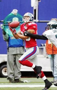
New York Giants.
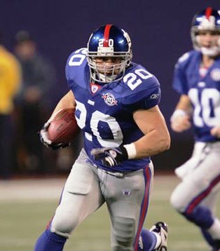
Helmet Design: At first glance, I was ready to call this baby a beauty, but there are some minor details I don't care for. I love the color and the simplicity of the lower case ny. But I have to deduct points for the red stripe and little numbers on the front. I like the gray cage.
Score: +1.
Color Scheme: Red, white, and blue...and gray? If your heart is just set on a fourth color, silver would look better. But I'm a red, white and blue fan, so it's a thumbs up.
Score: +1.
Jersey: Three versions. I like them all. You have the traditional home blue, alternate red, and away white. I like the look of the red numbers on the white jersey. Still don't like the shoulder numbers though. No busy striping. All very simple designs.
Score: +1 home, +1 alternate, +1 white, average of +1.

Leg Wear: The gray pants are all the same, home, alternate, or away. By themselves they look okay, but with the jersey choices, they don't fit. And could you picker a duller looking gray? I love the red socks and black shoes on the alternate uniform.
Score: -1 for home, -1 for away, and +1 for alternate, average -0.3.
Overall Effect: This is a kind of throwback uniform design. I would have liked it more, but those gray pants might as well be brown. They just are not sharp when taken in with the uniform as a whole. Make them silver, and we might have something.
Score: 0 home, 0 away, +1 alternate, average of +0.3.
Historic Factor: The Giants have always had a pretty decent looking uniform.
Score: +1.
Summary:
HD: +1
CS: +1
J: +1
LW: -0.3
OE: +0.3
HF: +1
TOTAL GIANTS SCORE: +4.
No comments:
Post a Comment