
Cincinnati Bengals.
Helmet Design: Seizure, anyone? I'll give this monstrosity this- it is easily identifiable as to which team you are watching. I'd sure hate to play for this team. It only gets worse from here. The funny thing is, when this first came out in the early 80s, I kind of liked it. That's because it looked okay with a plain brown jersey with white pants. So I won't give it -2. But as this whole outfit has trended more and more toward the psychotic, it looks as ugly as brown snow.
Score: -1.
Color Scheme: Orange, dark brown, and white. Could look good. But when there is too much orange, it makes one want to turn away.
Score: -1.

Jersey: Three varieties here, all with shoulder pad numbers I don't care for. Home brown with orange stripes on the sleeves and around the white numbers, with white stripes on the sides. We then get a basic white number with orange sleeves and brown stripes, and brown numbers with an orange border. And to top it all off, a nice orange gagger with brown sleeve stripes and white numbers. This is perhaps the cruelest practical joke to have been played in the history of pro football. And the city of Cincinnati has not figured it out yet. Your uniform designer is from CLEVELAND, folks. And he's laughing all the way to the bank.
Score: -1 for brown, -1 for white, -2 for orange, for an average of -1.3.


Leg and Footwear: This is getting very monotonous. Ugh. Two varieties here. An unattractive white with brown and orange tiger stripes, or brown with even worse orange stripes. Brown socks aren't bad, but long orange ones? Straight out of Pippi Longstockings closet.
Score: -1 and -2, for average of -1.5.
Overall Effect: Nausea, vertigo, fainting, seizures, blurred vision, and GI distress. The very definition of Gollum ugly.
Score: -2.
Historic Factor: Bengals never have had a purty uni. But come on, it wasn't this ugly. -1 for the regression. I don't think one can argue that this is ugliness of historic proportions, so I have to give it another -1 for effort.
Score: -2
Summary:
HD: -1
CS: -1
J: -1.3
LW: -1.5
OE: -2
HF: -2
TOTAL BENGALS SCORE: -8.8
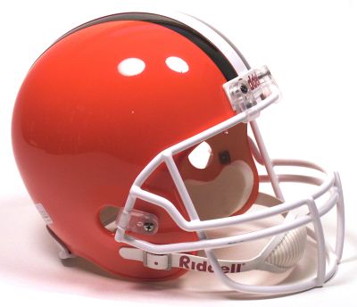
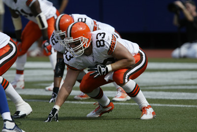
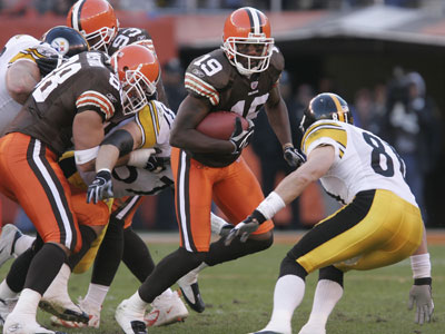
Cleveland Browns.
Helmet Design: Simple. I like it. I even like the stripes, which only work when the design is simplistic. I even like the white face mask. The only thing keeping it from a +2 is that it is, after all, orange.
Score: +1
Color Scheme: Brown, orange, and white. Just about every combination of the three is represented, kind of like the 1970s Oakland A's. Which is a shame.
Score: 0.


Jersey: The brown with white numbers and white and orange stripes is a nice design. Ditto the white with brown numbers and orange/brown stripes. I even like the white shoulder pad numbers on this brown one. But what possesses teams to do this:

Hello, this team's name is THE BROWNS, not the Oranges.
Score: 1 for brown, 1 for white, -1 for orange (could have been -2, but they only wore this orange thing once thankfully). Average is 0.33.
Leg Wear: White pants with the orange and brown stripe dominates. But again, why ruin the uniform with orange pants? Love the brown socks though.
Score: 1 for white, -2 for orange, and 1 for the socks. Average: 0.
Overall Effect: Too bad there is so much mixing and matching, because this could really be a good looking ensemble. Cut out the orange pants and the orange jersey, and this coulda been a contender. But alas we sometimes have to look at this:
Score: +1 for brown j with white p, +1 for white j with white p, 0 for white j with orange p, -1 for brown j with orange p, and -2 for orange j with white p. (Sorry about the abbreviations, p sounds a little crude in the wrong hands). Average is -0.2.
Historic Factor: Little change over the years is worth a score of +1.
Summary:
HD: +1
CS: 0
J: +0.33
LW: 0
OE: -0.2
HF: +1
TOTAL BROWNS SCORE: +2.13
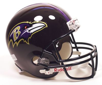
Baltimore Ravens.
Helmet Design: Black as the basic color is good. A little gold is good also. Add a little purple to this, okay, enough already. Add in a little white, and I have to ask what is going on here? Too many colors together, even though they all individually would be good. I think that someone could not make up their mind here what they wanted to go for. Maybe too many cooks in the kitchen. So it ends up sort of a mess. (And I haven't even got to that orange-red color I see in this bird's eye). I like the look of the bird on the helmet, but does he really need a B branded in to his temporal lobe? And is that a stripe I see? I think it is but who can tell? Lose it, please, and some of the colors, and we would have a winner here.
Score: 0.
Color Scheme: I'm not exactly sure what it is. Seriously. I think it's purple, white, black, and gold. (Although maybe it's black, purple, white, and gold; or maybe it's purple, gold, black, and white; or maybe it's black, gold, purple, and white; oops, I forgot that orange-red color; so let me start again...). I've thought about this, and 4 colors is too many, three is enough. So which one has to go? Black, I think. The black trend in uniforms is over (I hope). So again, the score does not live up to its potential.
Score: 0.
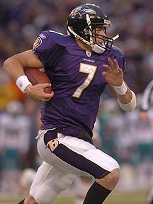
Jersey: Nice purple home version and nice white away type. Semi-mod number style is not bad, but the 3D effect on the white rendition induces some diplopia. The patch on the sleeve is supposed to be something, but you can't tell what it is without an extreme close-up, therefore, what good is it? Not a fan of the shoulder pad numbers, as I now mention for the nth time. But it's agreeable with my stomach, which is still recovering from Cincinnati.
Score: +1.
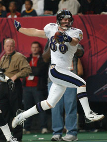
Leg Wear: I like the white shoes, and white with purple socks, but again what is with all the black? The black stripes on the socks on the away version, and the black socks on the home version, it's just a little too much. A nice solid purple stripe without the black border would be better. I like the gold B on the hip, which is where this belongs, not on the helmet.
Score: +1 for away, 0 for home, average 0.5.
Overall Effect: This uniform could be so cool. So why isn't it? Because someone is trying to be a little too fancy. Simplify, and this would be the sharpest outfit in this division and a contender for best in conference.
Score: 0.
Historic Factor: Not much history to this franchise, but this version is better than the original, particularly the helmet. So a +1 for you, Ravens.
Score: +1.
Summary:
HD: 0
CS: 0
J: +1
LW: +0.5
OE: 0
HF: +1
TOTAL RAVENS SCORE: +2.5.

Pittsburgh Steelers.
Helmet Design: Basic black. So far so good. Simple design, also good. Yellow stripe, not good, but not bad. I'm just not sure why it is there. It is not necessary. Love the circular decal with the steel symbol. And genius to have it on the right side only. This makes the helmet unique in all of football. You wouldn't call this beautful, but it is definitely pleasing to the eye.
Score: +1.
Color Scheme: Black and yellow, with some white. I think black and gold would look better, less bumble-bee-esque. But black and yellow is consistent with the rest of the city's sports teams, and therefore no points can be deducted for this.
Score: 0.
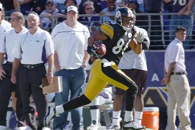
Jersey: Home black with yellow sleeves and white numbers, and sleeve stripes bordered by black. Numbers are a bit modern looking, and I don't like the shoulder pad numbers. The white away jersey with black numbers is even easier on the eyes. Thumbs up.
Score: +1.
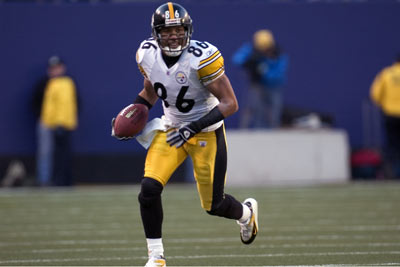
Leg Wear: Simple pants, yellow with a black stripe, home or away. Black socks are a plus.
Score: +1.
Overall Effect: A nice, tidy, simple uniform that looks good in home or away versions. And thankfully no hideous all black or all yellow disasters.
Score: +1.
Historic Factor: +1 for there being little tampering over the years. I mean really, what could you do to improve this? (Except maybe changing the yellow to gold, a la the Rams a few years ago? But then you lose the tradition).
Score: +1.
Summary:
HD: +1
CS: 0
J: +1
LW: +1
OE: +1
HF: +1
TOTAL STEELERS SCORE: +5.
No comments:
Post a Comment