If someone were to come up to you on the street where you live and asked you to wear an aqua colored shirt with orange trim, most, if not all of you, would recoil in horror. At least the men would. But if the same situation occurred in Miami, or another tropical environment, you might think again about it. And I can't believe I'm saying it, but I think this uniform would be one of the top crazes, if it weren't for some awful alterations made from time to time during the season.
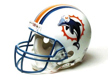
Helmet design-
On the strength of the football-helmet-wearing dolphin alone, this is a definite winner. I can give or take the stripes, which in general I usually dislike. But it doesn't busy up the helmet too much. It may be a little to wide down the middle, but that's okay here. The aqua colored cage is cool.
Score: +2
Color scheme:
Because of the simple fact this team is from Miami, this scheme of aqua, orange, and white works for me. It's simple, although bright. There is a little black emboldening of the stripes and the numbers, but that is well done. Because usually the color orange is kept to a minimum, I think these colors are attractive selections. White is almost always good on anything except yellow. This offering is tastefully done on the basic home and away versions. But heaven help us when they break out the alternative uniforms as noted and pictured at the bottom.
Score: +1
Jersey: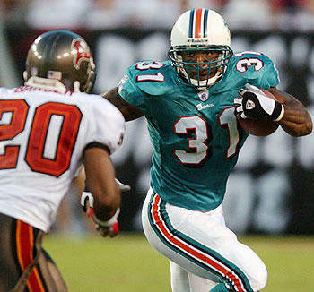
The traditional "home uniform" jersey above is solid. I put "home uniform" in quotes because these days Miami doesn't really have a home uniform. They wear any combination of anything, a la the 1970s Pittsburgh Pirates and Oakland A's. I like the white numbers with orange trim. I don't care for the shoulder pad numbers. But I like the little dolphin guy on the sleeves.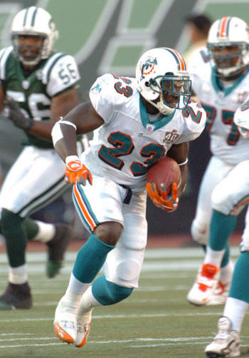
The traditional "away uniform" jersey is quite attractive also. Again I don't care for the shoulder pad numbers, but I like the V-neck with aqua trim. The numbers have a 3D look with the black embellishment.
I don't know what to say about the orange alternate jersey. Those of you who remember my rant against the University of Illinois orange basketball uniforms will already have guessed I hate it. Fortunately we've only been subjected to it once or twice. So I will hold off judgment on this jersey until we get to the overall effect, and therefore not penalize the Dolphins twice for this version's ugliness.
Score:
Traditional home- +1
Traditional away- +1
For all you math majors, that averages to a +1.
Leg wear:
I love the white pants with central orange striping pictured above. The black, white, and aqua trim is plain Goldilocks- it's just right. The socks rule. A nice long aqua with white base. Lose the orange on some of the shoes, though. I had a rubber Bozo toy as a small child that had shoes like these orange jobs. Only difference was those clown shoes were size 35 EEE. Hard to run through holes and scramble with shoes that size.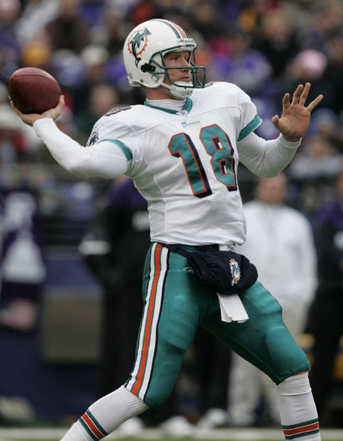
I'm neutral on the aqua pants. I dislike the boldness of the white striping. And notice the directional clashivity of the horizontal stripe on the sock with the vertical stripe on the pants. I like it matched up with the white jersey, though. But we'll get to the overall effect next.
Compared to the orange socks on the alternate uniform, the aqua number's a masterpiece.
Score:
White pants/aqua socks- +2
Aqua pants- 0
Averages to +1.
Overall effect:
In this particular section of the universe of football fashion, the possibilities are endless for mixing and matching. Here's the matchups:
Aqua jersey and white pants- rules the roost. A +2.
White jersey and white pants- runner up. A +1.
White jersey and aqua pants- it's okay, but why bother. A 0.
Aqua jersey and aqua pants- Something an 80 something Miamian might wear. Getting close to the loser label. A -1.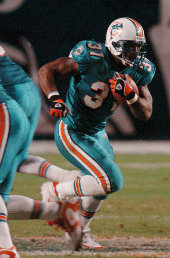
But the eternal question remains. What possesses teams to do this: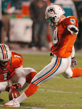
Orange jersey- the very defintion of Gollum ugly. A -2.
How do your eyes feel looking at this? Not good, eh?
Score:
In summary, because of the variations, the Miami uniform taken as a whole is a big fat 0.
Historical factor:
I love the traditional Miami uniform. They do need to stop the mixing it up. And they have had the sense to leave the helmet alone except for minor variations, which to me is worth one bonus point.
Summary:
HD- +2
CS- +1
J- +1
LW- +1
OE- 0
HF- +1
TOTAL DOLPHINS SCORE: +6.
Up next? The New York Jets.
No comments:
Post a Comment